

What Is A Responsive Website And Why Do I Need One?
If you have a website – whether it be a personal blog, a landing page for your business, an e-commerce site, or anything else – you’ve likely heard the phrase “responsive website design” mentioned, but you may not be sure exactly what it’s referring to.
This article will explore what responsive design is in regards to websites, and discuss the benefits of implementing responsive design in your own website. There’s almost no reason not to do it – in fact, a website with unresponsive design can actually turn away potential visitors.
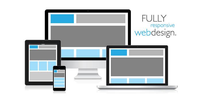
What is responsive website design?
Responsive design is design that, well, responds to each particular user. As more and more devices become internet-enabled, they have different capabilities and limitations. It’s much easier to read long articles on a computer screen than a small smartphone, for example; responsive design accommodates the capabilities and limitations of the current device.
How is responsive design created?
Websites that are designed to be responsive are coded with flexible layouts and a flexible grid system. This enables individual elements to be moved around as necessary to accommodate the device the website is being viewed on, and eliminates the necessity for a separate mobile version of a website – the website itself is coded to have the capability to adapt when necessary. This allows much greater flexibility and utility for both the user and the website owner. With responsive design in place, there is no need to re-work the website each time a new device is released, for example. It’s mobile friendly from the get go.
Why do I need a responsive website?
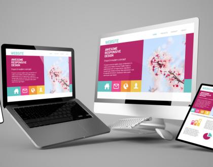
Today, people are shifting between devices with more and more fluidity. Apps enable you to save links on your desktop computer at work, for example, to be seamlessly read on your mobile device as you ride the subway home. Teleworking is increasingly common. Online shopping is disrupting shopping malls on a large scale. Having a website that transitions easily from computer screen to tablet to cell phone is absolutely essential to maintaining a brand identity. You want visitors to be able to get the information they need at the moment they click onto your site – not to be frustrated with the design, decide to look it up later on their home computer, and then forget.
What we believe
Websites featuring responsive design are the future. They’re sleek, beautiful, and easily navigable. They’re computer and mobile friendly. They look great on any device. Here at 445 Media, we create customized responsive for small businesses that are quick, stylish, easy to use, and look beautiful on any screen. We believe that small businesses should have great websites at an affordable price, and we work hard to ensure our clients receive the best website for their needs.
Recommended Posts

Want a FREE Website or Website Redesign?
November 11, 2020
Web Design Today
July 23, 2020
SEO vs SEM
September 9, 2019